Hi guys,
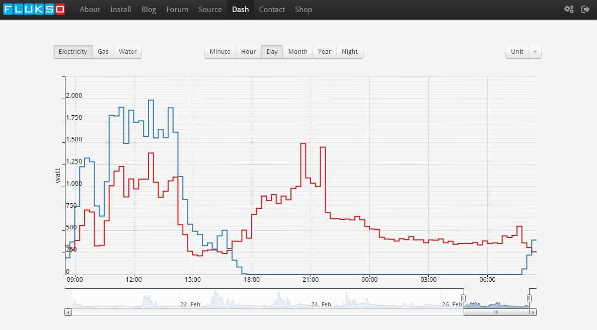
I have following question: when I'm off to work, I expect the graph of consumption to be quite stable and straight forward.
However, when my solar panels start to work, they get measured quite correctly, but the consumption line (the red one in the attachment) changes accordingly with the solar panels.
Is there a way to let it show the effective consumed amount of watts without the influence of the solar panels?
That way I can see exactly what I consume and what I gain. My Smappee does it that way, but I hope the Flukso can do that to. OR I hope to have wrongly configured the dash... :-)
I also believe that this is the reason why the values in PVoutput are nog correct.
See attachments to see as is and how I expect it to be (APPROX.!).
Thanks!
Kristof
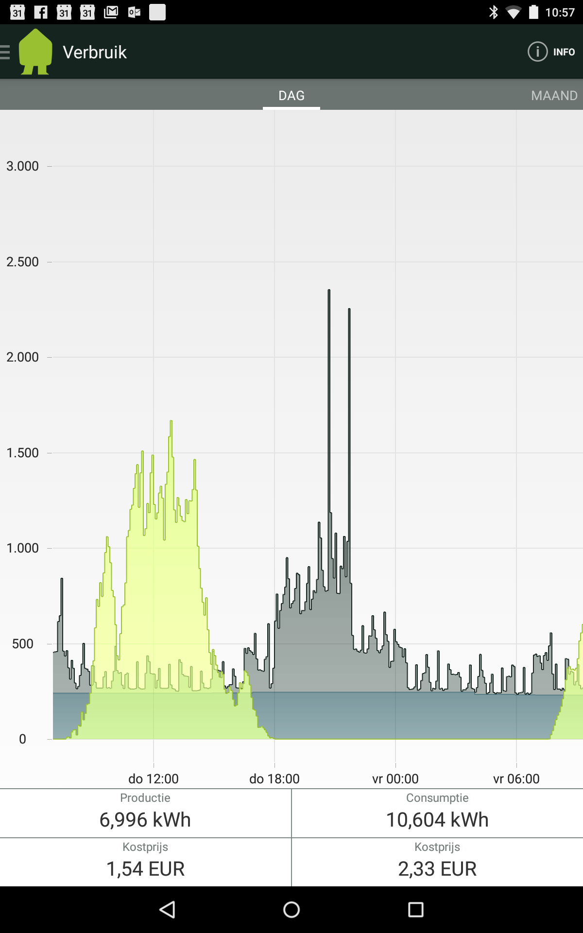
EDIT: Just added the graph of my Smappee, which is extremely accurate. The grey graph is the one that should mostly accord to the consumtion line (red) in the dash.
EDIT 2: Also added a more stretched version of the Smappee screenshot. That makes it easyer to compare. :-)
| Attachment | Size |
|---|---|
| As is.jpg | 181.25 KB |
| As expected to be (green line).jpg | 183.61 KB |
| Smappee.png | 146.44 KB |
| Smappee (stretched).png | 432.01 KB |
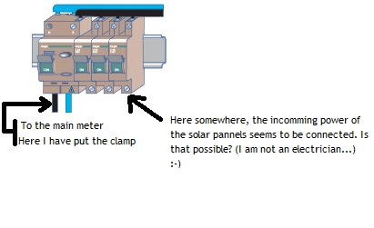
| How I think the solarpannels are connected.jpg | 21.76 KB |
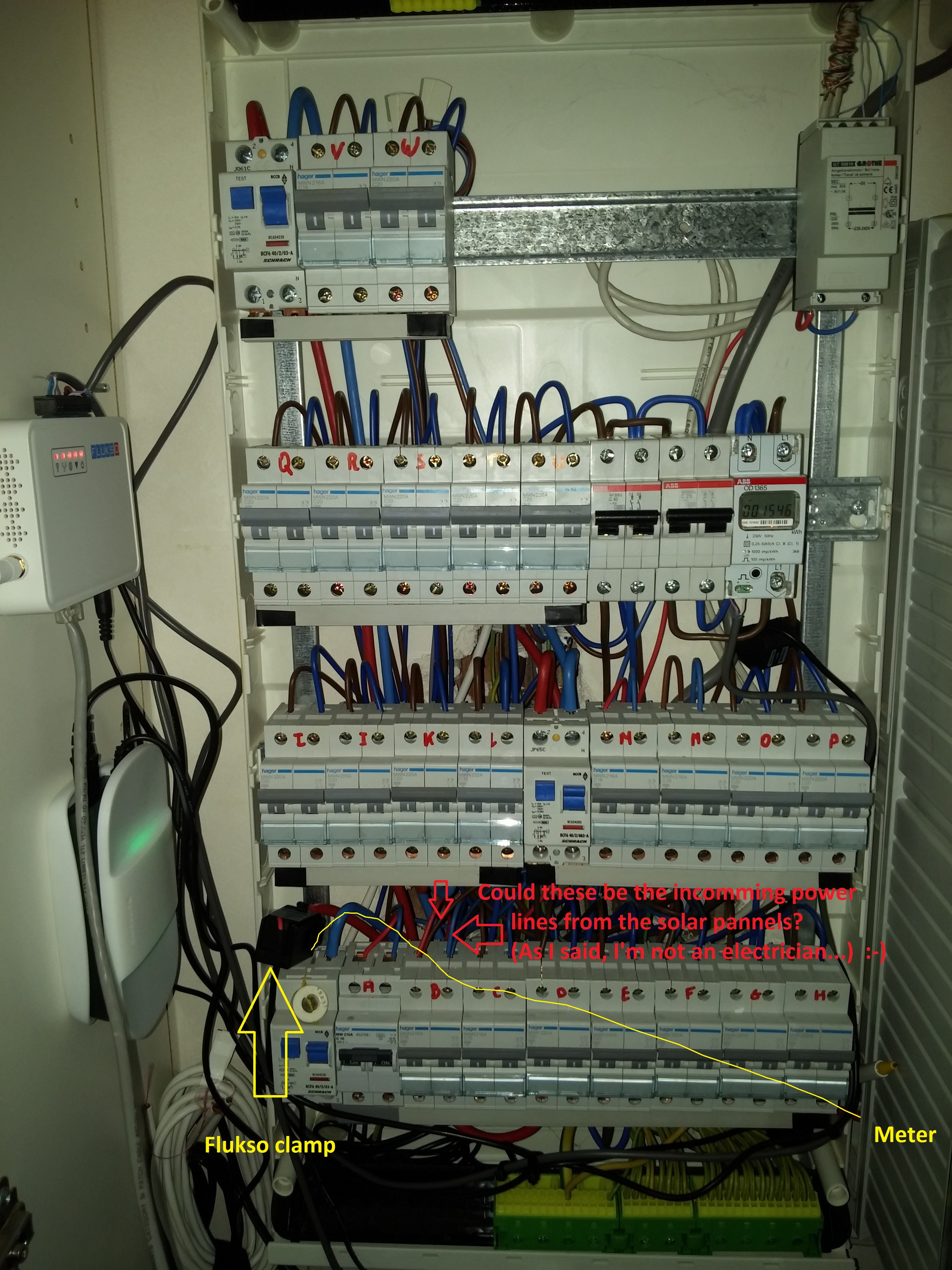
| Zekeringenkast met indicatie.jpg | 2.84 MB |
_0.jpg)
.png)
Could you as an addition provide information on your cabling, thus where with sensor is connected - in the pure consumption path, in a provisioning path or in a combined? - see https://energyhacks.wordpress.com/2014/07/10/wire-to-measure/ to provide a hint that due to Mr. Kirchhoff you may measure at a "wrong" position...
Also, I think this is a question of correct representation. E.g. when a measurement is taken every 5 minutes, values in between are not recorded so it would be wrong to smoothen these out as the green 'as-expected' line does, unless of course the Smappee measures every 10 seconds or so.
But, looking at the other Smappee png's, I think both Flukso and Smappee's measurements are correctly displayed (blocks, no smoothing).
Question remains: how is this smooth green line generated?
The measurements are done at a much higher rate, they are only uploaded at a 5 minute rate...
JGYSENBERGS, the green line is one that I drew my self in MS Paint. :-) To indicate what I expect as measurement.
The Flukso measures with larger intervals than the Smappee.
Smappee measures (I think!) as good as constantly, but the graph is made out of 5 minute blocks to save storage for their servers.
GEBHARDM, thanks for the link. It is clear as where to measure with the clamp, but I think that connecting the clamp in that way is impossible in my fuse box.
After work I will have another look at it and perhaps post a picture if it makes my statement more clear.
I think that connecting it that way is impossible because if I have seen it correctly, the incomming power of the solar pannels is connected AFTER the first differential switch. Is that possible? (I just made a drawing to explain in attachment, but am not at home so cannot verify exactly)
OK, found a picture of my fuse box. Just added it.
It is "Zekeringenkast met indicatie.jpg"
There is a thick gray cable entering the switch box on the top right - is this the incoming solar cable? where does it end? (somewhere to the bottom left in the shadow...) Better get an electrician before burning not alone your fingers...
No, that cable is the powercable for my alarm. It has sat there for 7 years and is removed last week because of a new alarm. :-)
The incomming solar cable is comming form the floor on the bottom side. (Not able to post a picture now.)
Please have a look at the separating household consumption and generated power and fuse box wiring forum posts.